Still overwhelmed by exam stress? You've come to the right place!
We know exam season has you totally swamped. To support your studies, access Gold Membership for FREE until December 31, 2025! Normally £29.99/month. Just Log In to activate – no strings attached.
Let us help you ace your exams efficiently!
Questions
MUF0051 ICT Unit 1 - Semester 2, 2025 2.18 Quiz: Types of graphs
Single choice
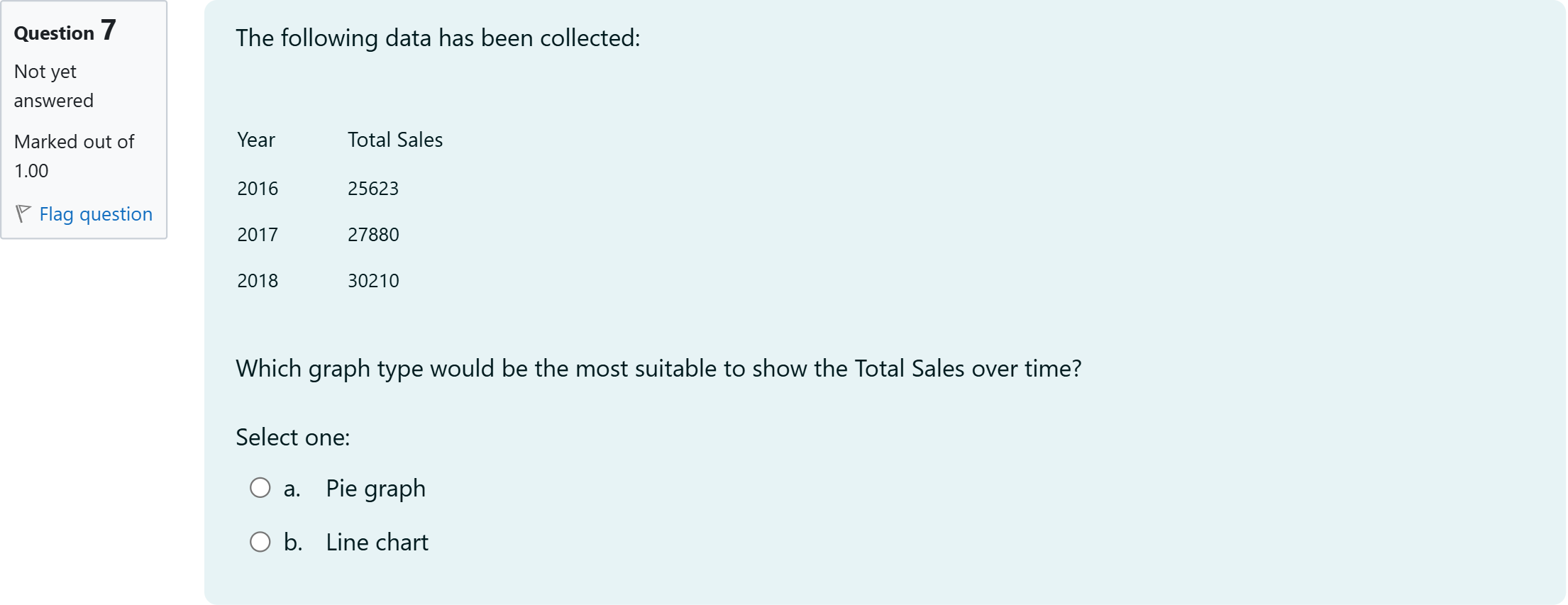
The following data has been collected: [table] Year | Total Sales 2016 | 25623 2017 | 27880 2018 | 30210 [/table] Which graph type would be the most suitable to show the Total Sales over time?
Options
A.a. Pie graph
B.b. Line chart

View Explanation
Standard Answer
Please login to view
Approach Analysis
To determine the best graph for showing Total Sales over time, we first restate the scenario and options to ensure clarity.
Option a: Pie graph. Pie charts are designed to display proportions of a whole at a single point in time, comparing parts to a total. They are not ideal for illustrating changes ......Login to view full explanationLog in for full answers
We've collected over 50,000 authentic exam questions and detailed explanations from around the globe. Log in now and get instant access to the answers!
Similar Questions
回顾一下住房数据集。哪个图最适合可视化像“房屋状况”这样取值范围为 1 到 5 的有序变量的配置?
When reporting descriptive findings to a client, it's important to:
Question at position 16 What is the main advantage of using a dot plot over a bar chart for certain types of data?It can display larger datasets more compactlyIt is better suited for continuous dataIt emphasizes individual data points and their distributionIt is more effective in showing time-series data
位置21的问题 In most cases, a graphical display is more useful than a table for recognizing patterns and 题库 1/1[input].
More Practical Tools for International Students
Making Your Study Simpler
To make preparation and study season easier for more international students, we've decided to open up Gold Membership for a limited-time free trial until December 31, 2025!