Questions
EXC19E2 - Microsoft Excel 2019 Level 2 Module 1 Quiz
Single choice
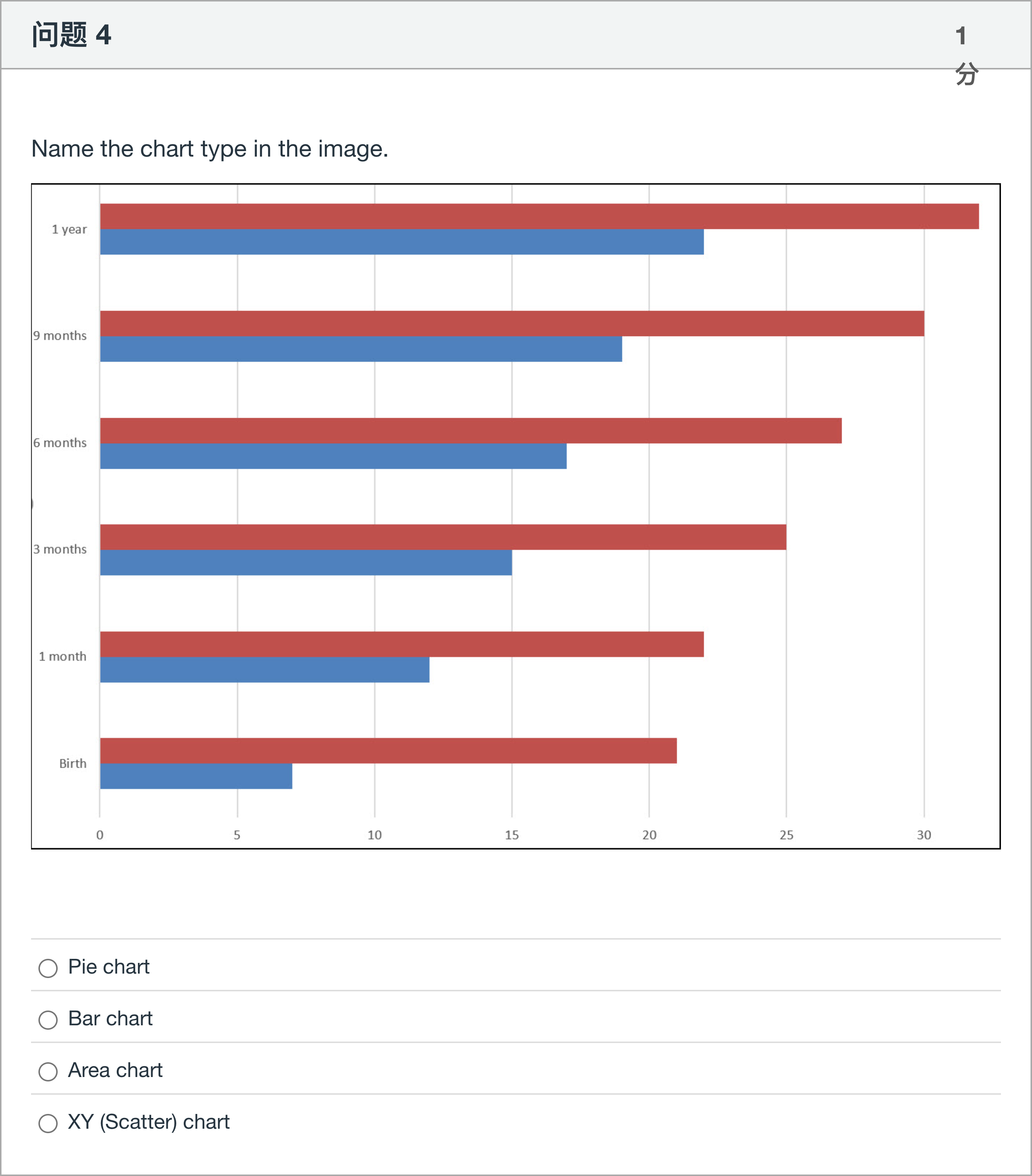
Name the chart type in the image.
Options
A.Pie chart
B.Bar chart
C.Area chart
D.XY (Scatter) chart
View Explanation
Verified Answer
Please login to view
Step-by-Step Analysis
The question asks you to name the chart type shown in the image, and provides four possible options.
Option 1: Pie chart. A pie chart displays data as slices of a circle, representing parts of a whole. The image instead shows elongated horizontal bars extending from......Login to view full explanationLog in for full answers
We've collected over 50,000 authentic exam questions and detailed explanations from around the globe. Log in now and get instant access to the answers!
Similar Questions
What does the following ggplot2 code do using the Titanic dataset? ggplot(titanic, aes(x = Survived)) + geom_bar()
Which type of graph is shown below?
Which type of graph is shown below?
These data come from a case-controlled study to examine the potential relationship between age at first pregnancy and cervical cancer. In a case-control study a random sample of cases (i.e. people with the disease in question) and controls (i.e. people similar to those in the case group, except they do not have the disease) and the proportion of people with some potential risk factor are compared across the two groups. In this study we will be comparing the proportion of women who had their first pregnancy at or before the ages of 25, because researchers suspected that an early age at first pregnancy leads to increased risk of developing cervical cancer. The data is presented in the table below: Age at First Pregnancy <=25 Age at First Pregnancy>25 Cervical Cancer 42 7 Control 203 114 Which graph is an appropriate graph to represent this data?
More Practical Tools for Students Powered by AI Study Helper
Making Your Study Simpler
Join us and instantly unlock extensive past papers & exclusive solutions to get a head start on your studies!